Crafting a Centralized Marketplace for a Unified Global Community
Project
Uni.xyz Marketplace
My Role
UI/UX Designer, Researcher
Duration
8 Months, 2021
Type
E-Commerce, Responsive Web
Team
Designer x 2, Sr. Designer x 1, Developers x 8
About Project
Crafting a Unique Space for Creative Innovation
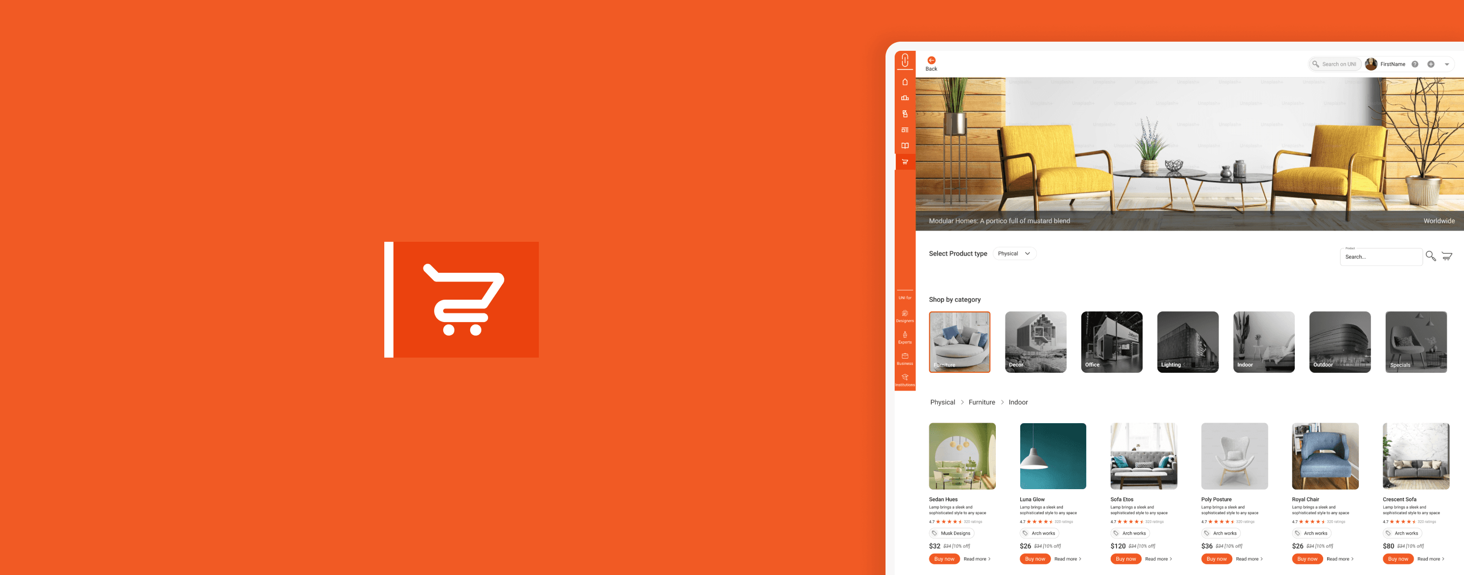
UNI.xyz, the world’s largest architecture competition platform, connects designers, architects, and experts globally. As a UI/UX Designer at UNI, I contributed to the design of Marketplace Segment, creating a hub for creatives to showcase, promote, and trade their work.
Our goal was to transform UNI’s marketplace into a fully interactive space for listing, purchasing, and promoting digital and physical products.
Background
Evolution of UNI’s Marketplace Hub
Since its inception, UNI has connected architects and designers worldwide, offering a platform for competitions, project showcases, and knowledge-sharing. By 2021, with over 200,000 users, UNI had grown into the world’s largest architecture competition hub.
200K+ Global Users
However, rapid growth revealed a missing piece in UNI's ecosystem, a centralized marketplace for users to promote, trade, and sell their creative products.
Understanding UNI's Ecosystem


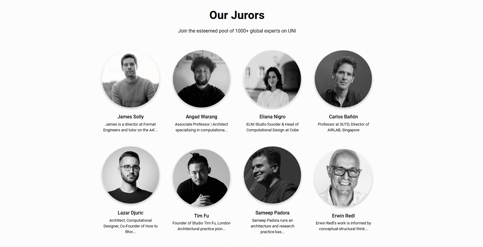
Background
Evolution of UNI’s Marketplace Hub
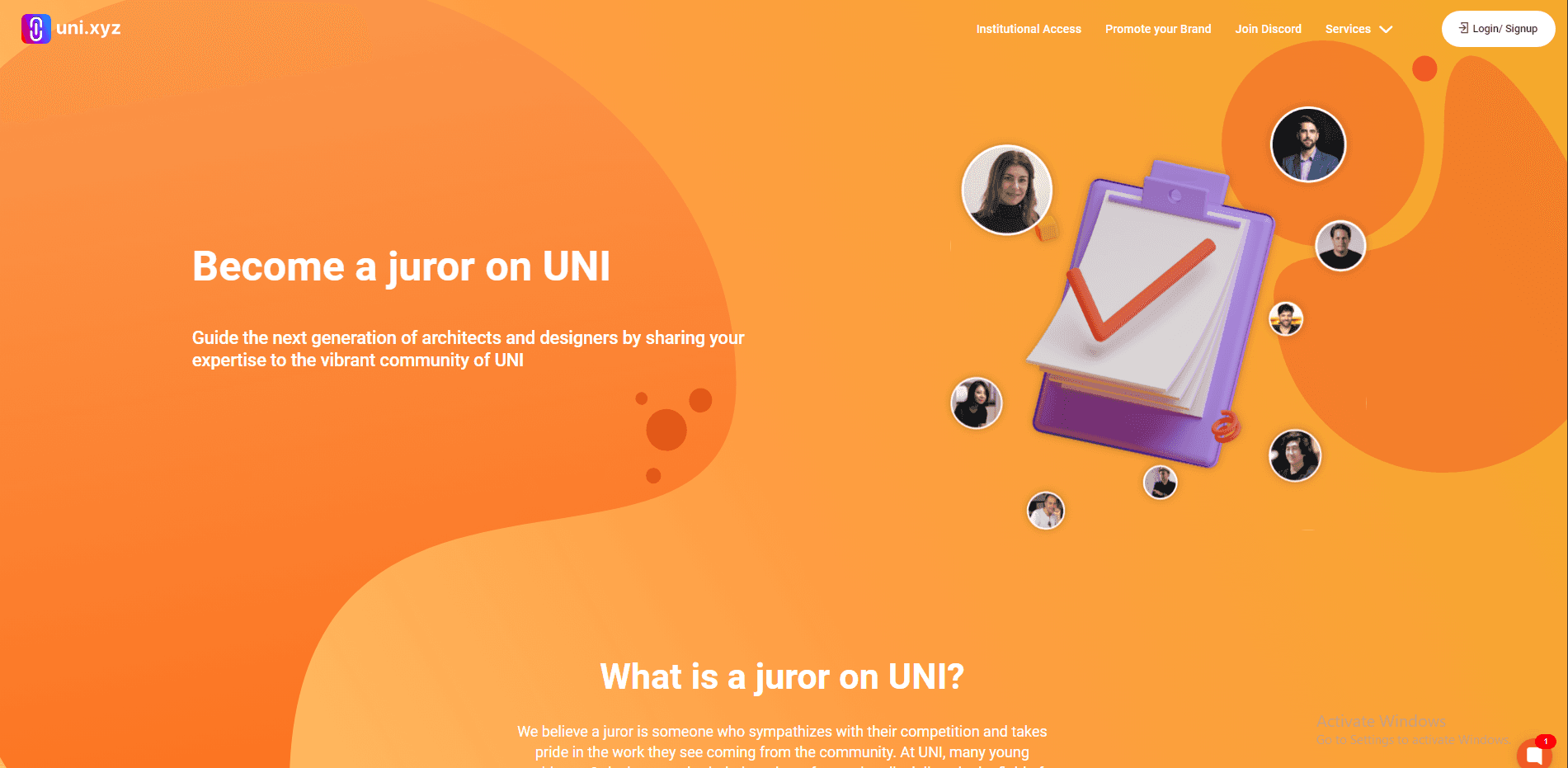
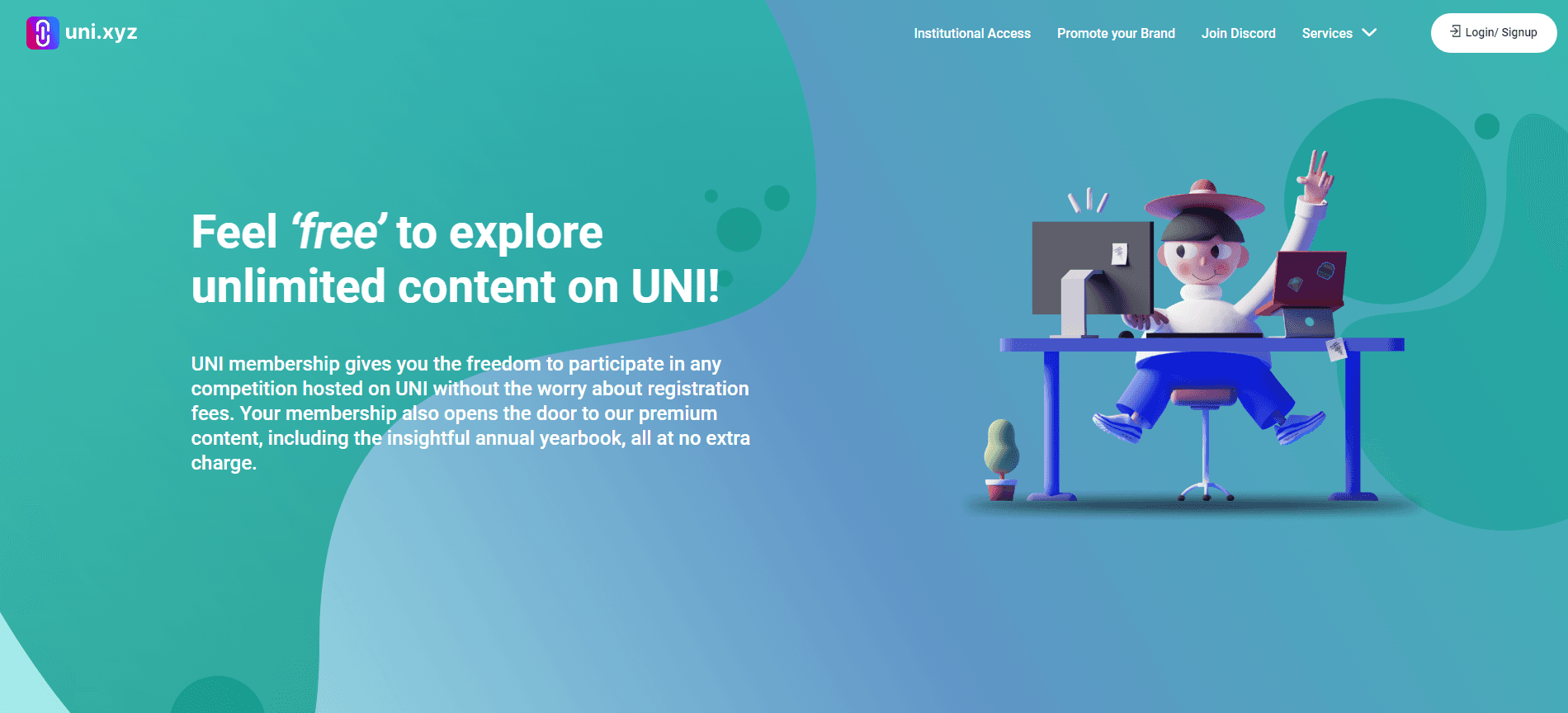
UNI is structured around five key segments, each catering to a unique aspect of the design community:
Competitions – Engage with design challenges from top institutions.
Projects – Showcase and share creative work for feedback and visibility.
Journals – Write and share insights on design processes, ideas, and trends.
Publications – Publish research, reports, and digital content.
Collections – Curate personal galleries of favorite projects and inspiration.
This layout allows UNI to serve as a multifaceted platform, supporting professional networking, creative sharing, and now, marketplace transactions.
Problem
Without a Dedicated Marketplace
Before the marketplace, UNI faced limitations impacting user experience:
No E-commerce Section:
UNI enabled project showcases and competitions but lacked a centralized space for users to sell products, limiting visibility and engagement.
Traffic Drop-off:
Users left UNI prematurely, redirecting to external sites for purchases and missing out on UNI’s community benefits.
Problem Statement
How might we seamlessly integrate a marketplace within UNI’s platform that allows the community to discover, list, and purchase products, empowering designers and businesses to expand their reach?
Solution
A centralized marketplace for users
One-stop solution for sellers and buyers of UNI community

Product uploader
for Sellers
An intuitive uploader within each seller’s profile, enabling quick listing with fields for name, description, price, etc and preview their listings to ensure accuracy before publishing.
Purchase Center
for Buyers
A streamlined experience allowing buyers to browse, add items to their cart, and complete transactions within the platform, enhancing convenience and engagement.
This approach ensured that both listing and purchasing were seamless and accessible, meeting the needs of UNI’s diverse user base.
The Process
How Did We Get There?
Research &
Discovery
Strategize
Design
Usability Test
Handoff &
Development
Gather insights into user needs and current platform gaps through analysis to inform the marketplace’s direction.
Define the marketplace’s core features, user flows, ensuring alignment with user goals and platform objectives.
Develop wireframes, prototypes, and high-fidelity mockups, focusing on a seamless, user-centered experience.
Perform usability testing to validate design effectiveness
Collaborate with the development team for a smooth implementation.
Discovery
User Research Insights & Validation
Conducted surveys and interviews with stakeholders and 500 active users, targeting a mix of designers, architecture firms, and students.
Research Methodology: Surveys
Participant Demographics: Designers: 40% | Architecture Firms: 30% | Students: 30%
Key Findings
70%
Interest in Selling Products:
Over 70% of designers showed interest in listing digital resources (e.g., templates, guides) and physical items directly on UNI.
65%
Buyer Demand:
65% of users expressed a desire to purchase products within UNI’s ecosystem, eliminating the need for redirection to external sites.
These insights underscored the importance of creating a streamlined marketplace experience that catered to these varied needs. We were set on building a space that was cohesive, user-centered, and allowed UNI’s creative community to expand their reach and impact.
User Persona
The user personas were crafted to represent UNI’s diverse community, including buyers like Selena, an interior designer seeking seamless access to unique products, and sellers like Marco, a freelance architect looking to monetize his expertise. These personas guided the design decisions to ensure the marketplace catered to real user needs, motivations, and pain points.


Marketplace Goals
Centralized Listings, Discoverability, and Secure Transactions
Our vision for the UNI Marketplace was to create a cohesive, intuitive space where users could list, purchase, and manage products seamlessly.
The primary goals were:
Marketplace Goals
Centralized Listings, Discoverability, and Secure Transactions
Centralized Product Listings
Enhanced Discoverability
Secured In-Platform Transactions
User flow
From Product Listing to Purchase
Seller User Flow: Listing a Product
Log into UNI Profile - Access Product Uploader - Fill Out Product Details - Preview -
Product Listing - Publish Product - Manage Product Listings

User flow
From Product Listing to Purchase
Buyer User Flow: Discovering and Purchasing a Product
Log into UNI Account - Browse and Filter Products - View Product Details - Add to Cart - Proceed to Checkout - Complete Purchase - Download Digital Product / Track Physical Order

Design
Bringing Marketplace to Life on UNI
The design for the UNI Marketplace centered on creating a cohesive, user-friendly experience that integrated seamlessly with UNI’s platform. Using UNI’s design library, I crafted intuitive layouts for both sellers and buyers, ensuring a consistent look and feel.
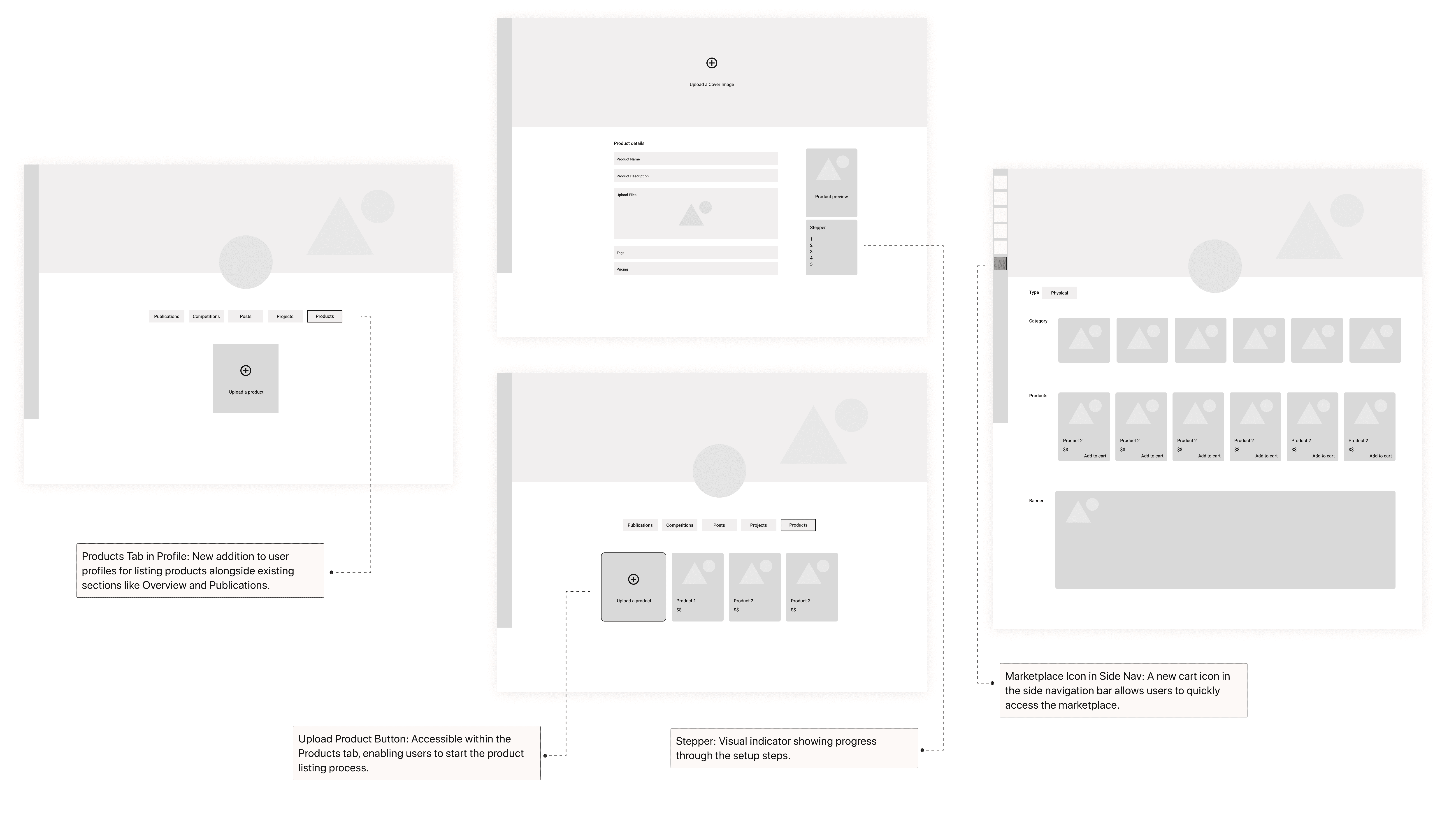
Solution 1
Product Uploader
It enables sellers to easily add product details directly from their profile, creating structured listings that boost visibility and engagement on UNI’s marketplace.
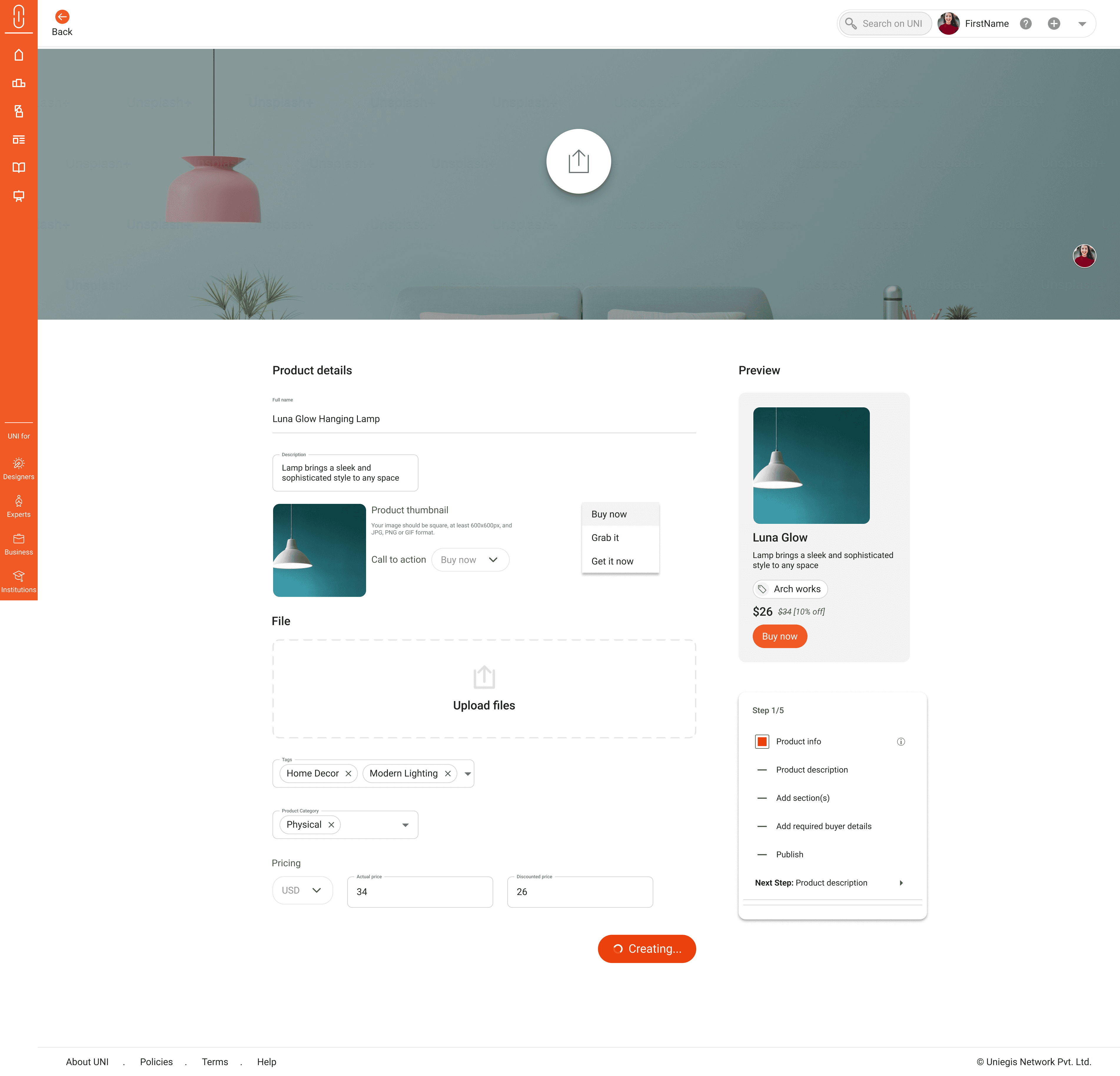
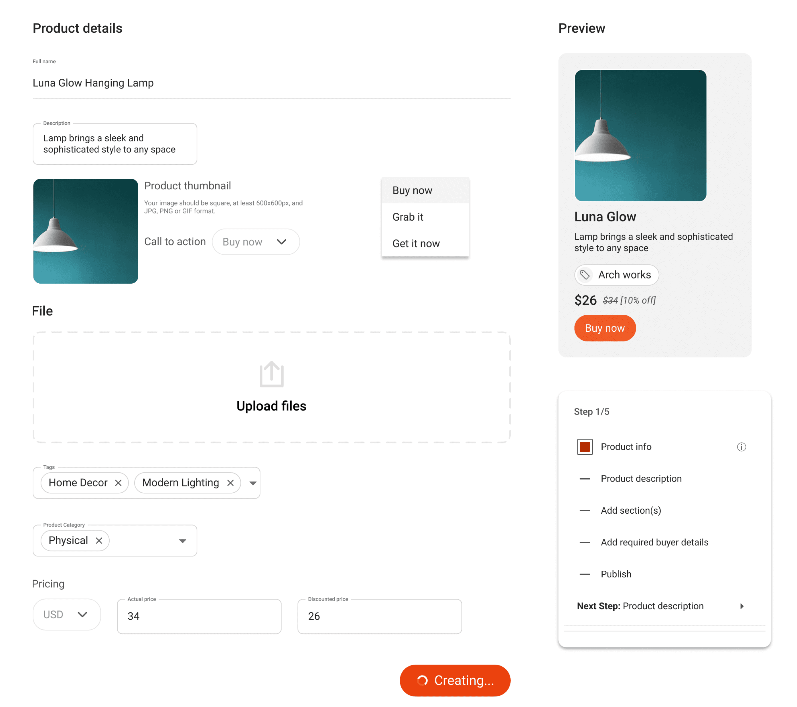
Product Details Section: Allows users to enter product name, description, and tags for better categorization
Call-to-Action (CTA) Button Options: Lets sellers choose customizable CTAs like “Buy Now” or “Get It Now” to enhance engagement.
Tags: Keywords such as “Home Decor” or “Modern” to increase product discoverability.
Stepper: Visual indicator showing progress through the setup steps.
Step 4:
Upload media, details and create
Interactive
Solution 2
Purchase Center
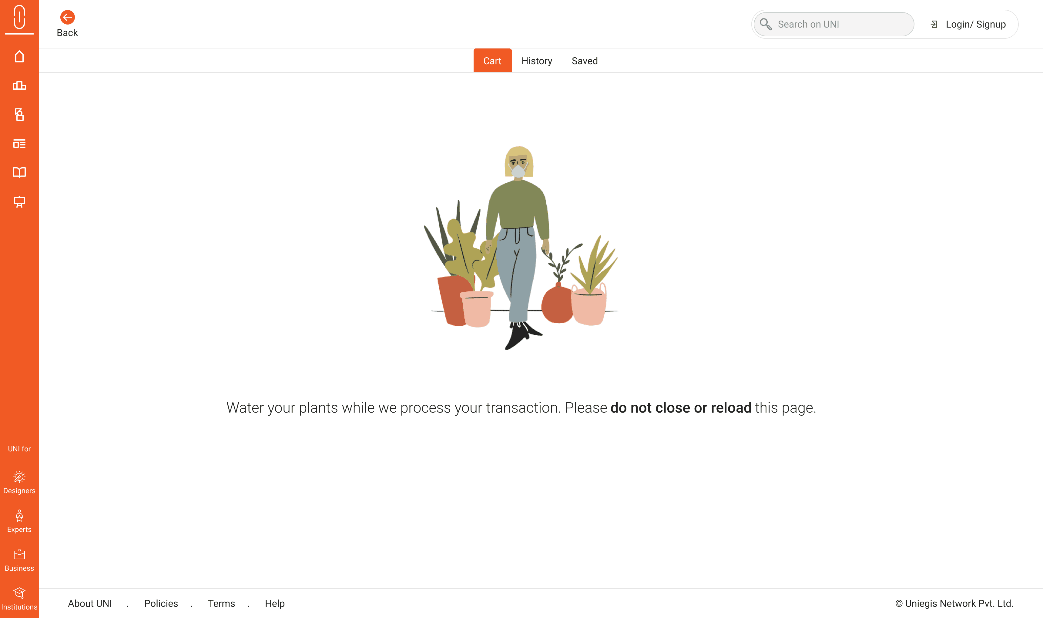
Provides buyers with an organized view of items and a streamlined purchase process, simplifying shopping with clear billing and secure payments within UNI’s platform.

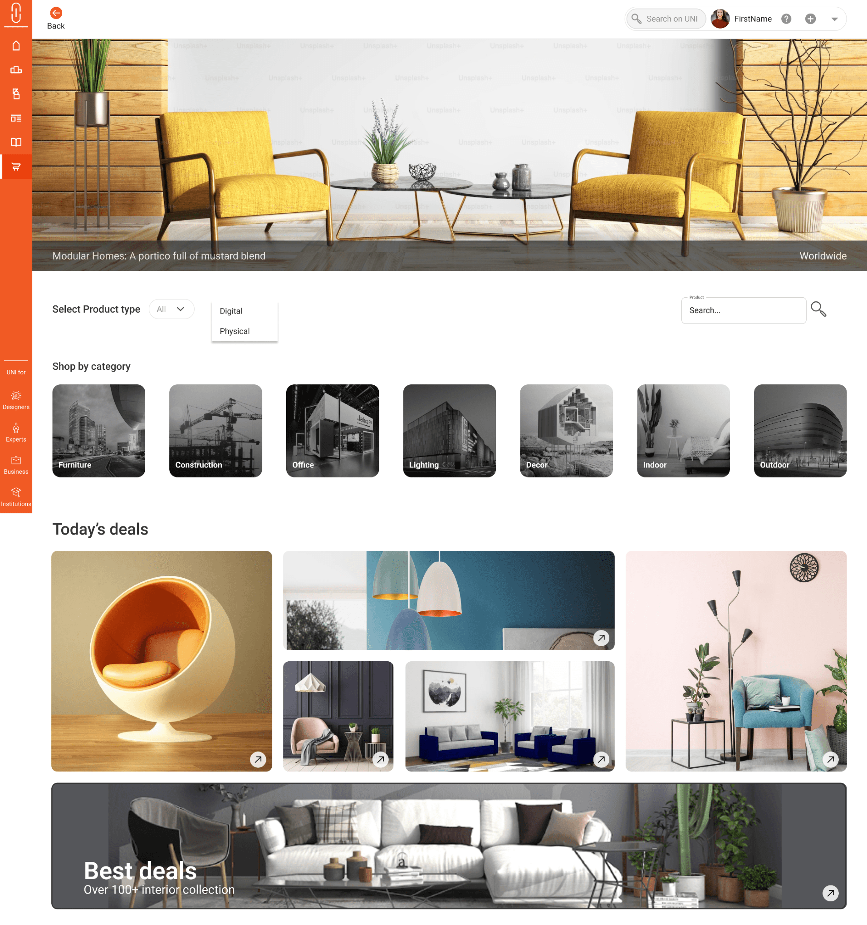
Marketplace Homepage: Upon clicking, the main marketplace screen opens, displaying categories and featured products.
Marketplace Icon in Side Nav: A new cart icon in the side navigation bar allows users to quickly access the marketplace.
Step 1:
Accessing the Marketplace
Interactive
Results
Setting Up Tracking Tools and Key Metrics
We used Google Analytics to monitor traffic patterns, engagement, and conversion rates. Key metrics tracked included Product Listings Growth, User Retention, Time on Marketplace, Conversion Rate, and Click-through Rate (CTR).
Additionally, we monitored daily and weekly product listings to assess successful use of the product uploader.
Product Listings:
Within three months, we saw a 25% increase in product listings compared to pre-launch estimations.
25% Increase
This validated that the marketplace’s design and functionality met seller needs, encouraging users to list more products.
Key Takeaways & Learnings
Uni.xyz Taught Me
User-Centered Design is Essential: Focusing on user needs and gathering feedback throughout the process allowed us to create a marketplace that truly resonates with UNI's creative community, enhancing usability and engagement.
Seamless Integration Drives Engagement: Integrating the marketplace naturally into UNI’s existing ecosystem helped retain users and fostered a cohesive experience, showing the value of consistency in design.
Collaboration Across Teams Enhances Success: Working closely with stakeholders and developers was essential for translating design vision into a robust, functioning product, emphasizing the importance of clear communication and teamwork.
Selected Projects
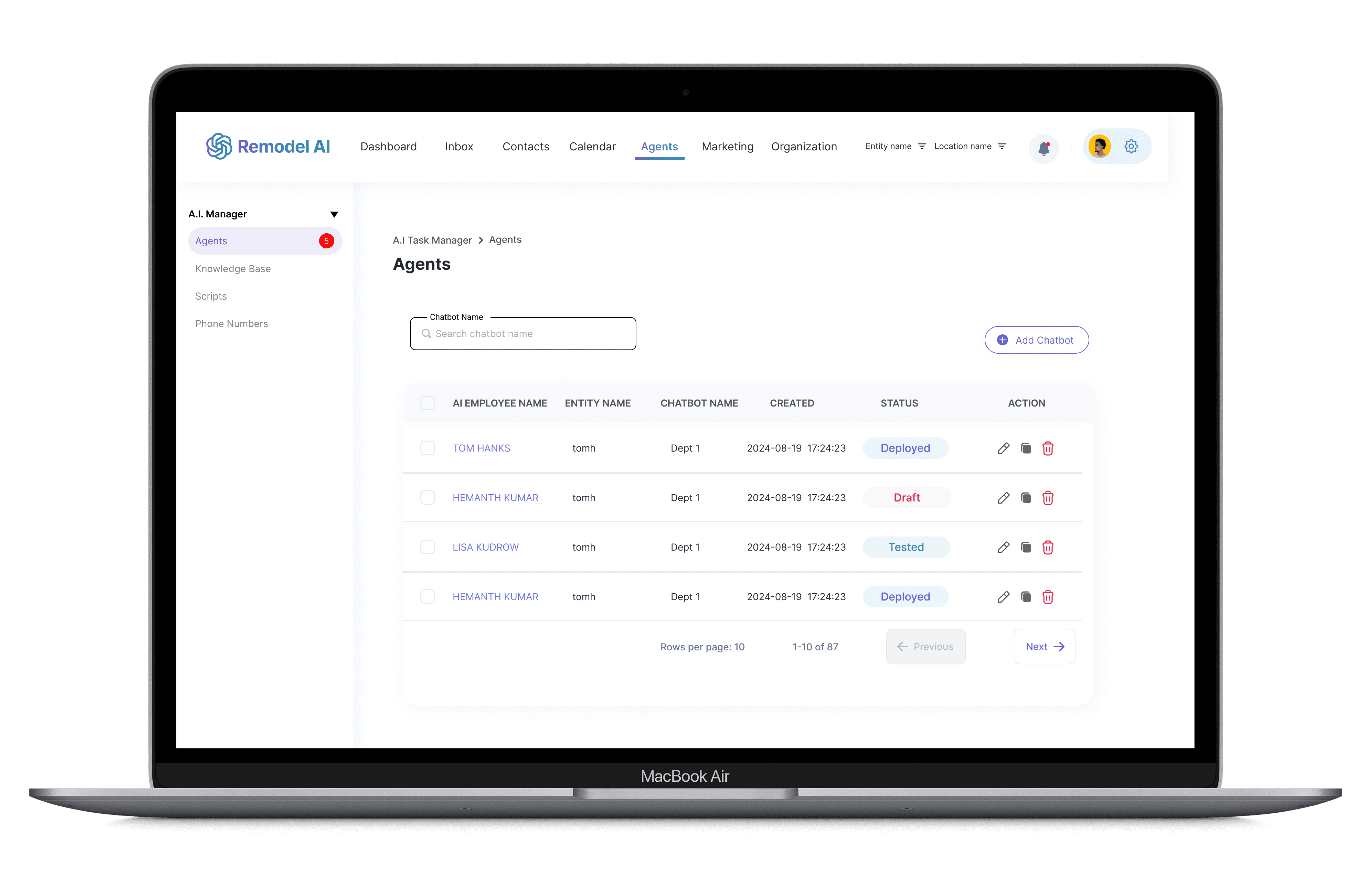
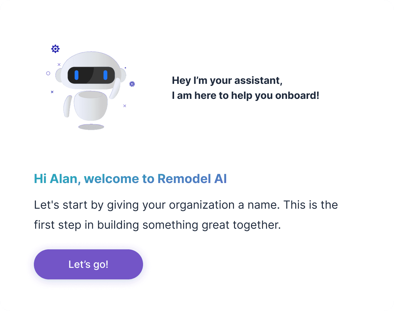
Remodel AI
Led a B2B platform redesign with a dedicated design system, achieving a 95% onboarding success rate.
View Casestudy
E-commerce
B2B
Gamification
Healthcare
Logistics
Fintech