Crafting a Skincare Recommendation Tool for Tailored Solutions
Project
O'Keeffe's
My Role
UX Designer, Researcher
Year
2023
Tools
Figma, Baymard Analysis
Overview
O'Keeffe’s Legacy Meets Digital Innovation
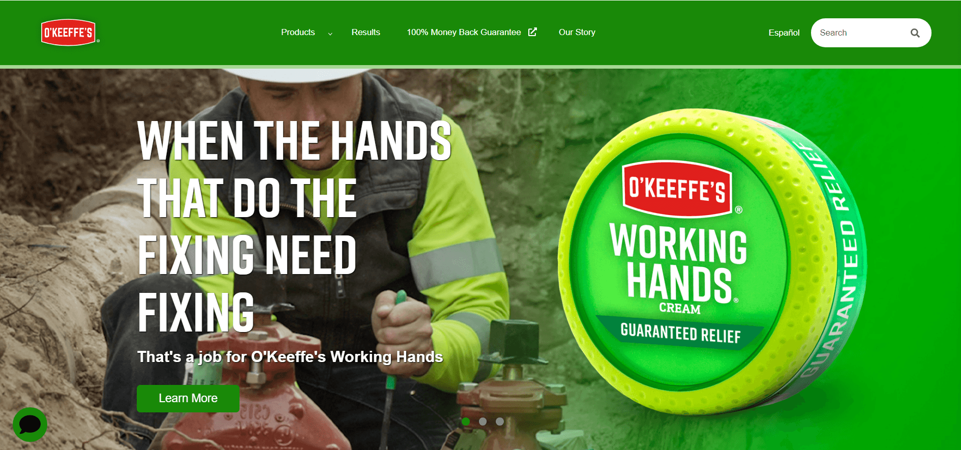
O'Keeffe's is a trusted skincare brand with a strong presence for over two decades across the USA, known for its renowned Working Hands cream. This product effectively treats various skin ailments, appealing to a diverse user base, from children to the elderly. Particularly popular among working professionals in labor-intensive industries, providing essential relief for hands exposed to harsh conditions.
#1
O’Keeffe’s stands as America's #1
Hand Cream Brand
20B
Skin care market
in the U.S is nearly
20 billion dollars
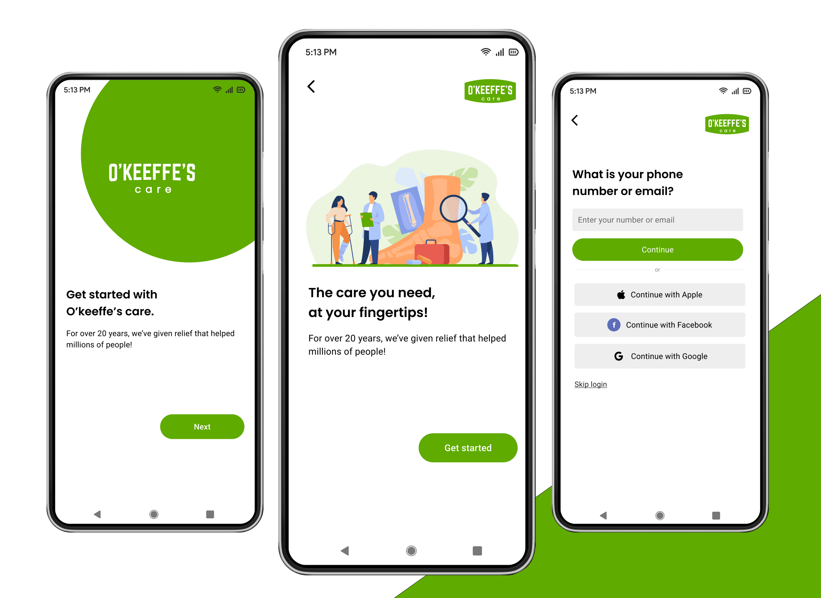
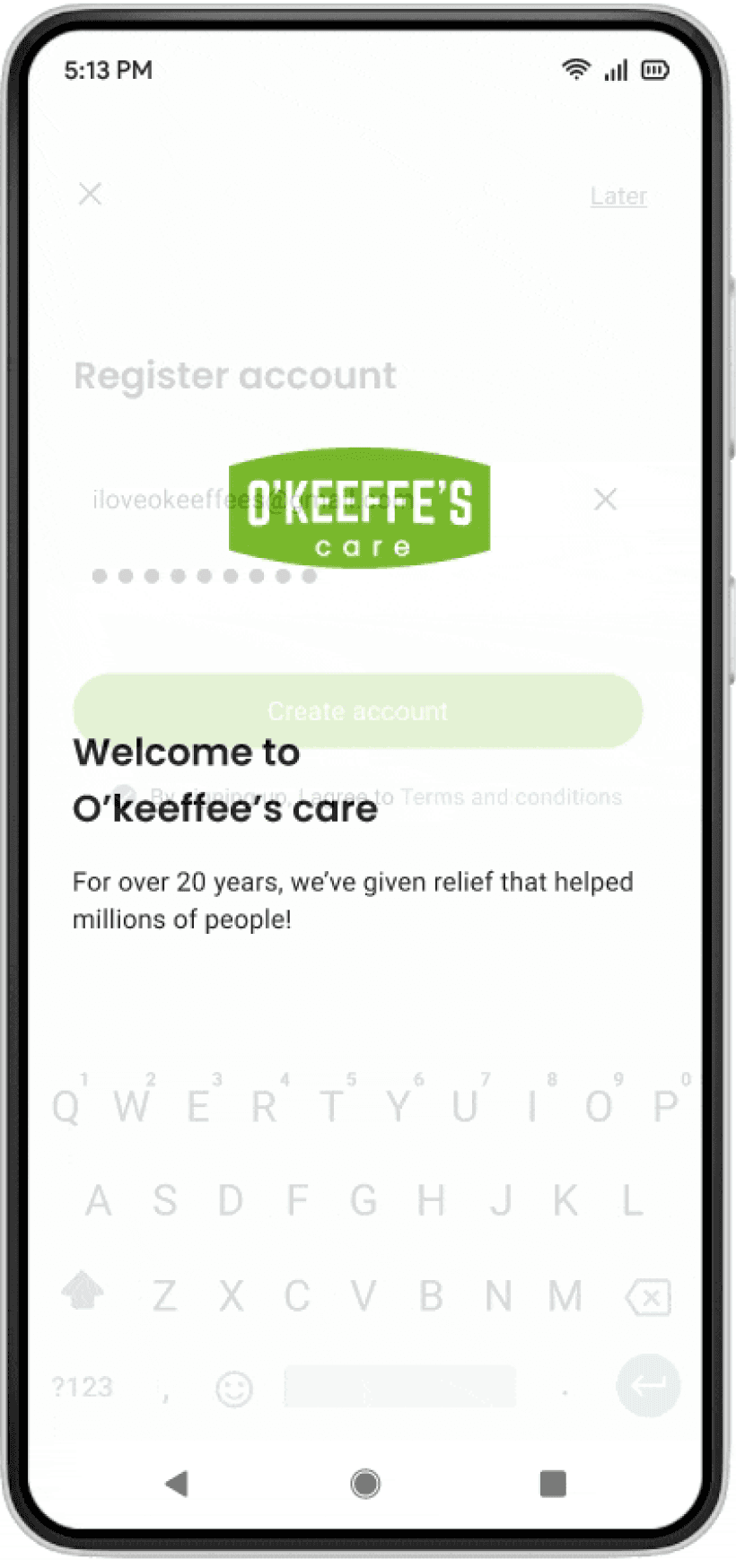
In this case study, I showcase how I created digital extension for O'Keeffe’s that combines e-commerce with personalized medical recommendations. The app empowers customers to manage their skincare, assess conditions, and receive tailored product suggestions while purchasing directly.
Highlights
Equipped with E-commerce Integration : A Digital Transformation
Expert skin care
anytime, anywhere.


Discovery
Ideate
Designing
Testing
Key Takeaways
Discovery
Uncovering the Gaps : Brand's Digital Experience
Though O’Keeffe’s boasts a significant user base, customers are still required to purchase products from retailers like Walmart and Target, where they often face challenges such as dosage confusion and product selection. The existing website reveals a considerable gap between the brand and its users, lacking essential e-commerce integration.
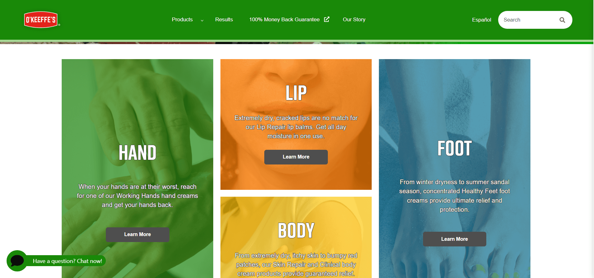
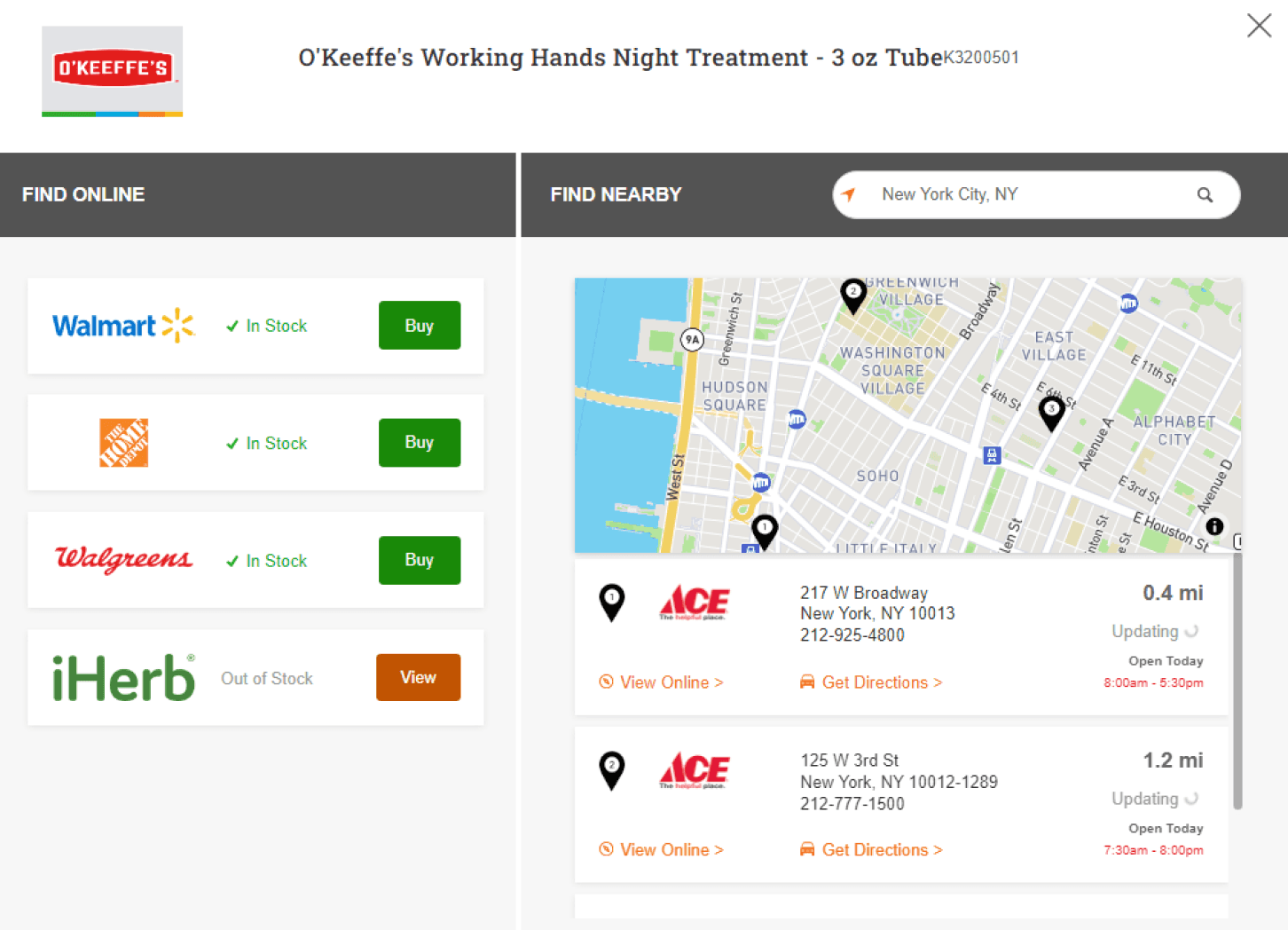
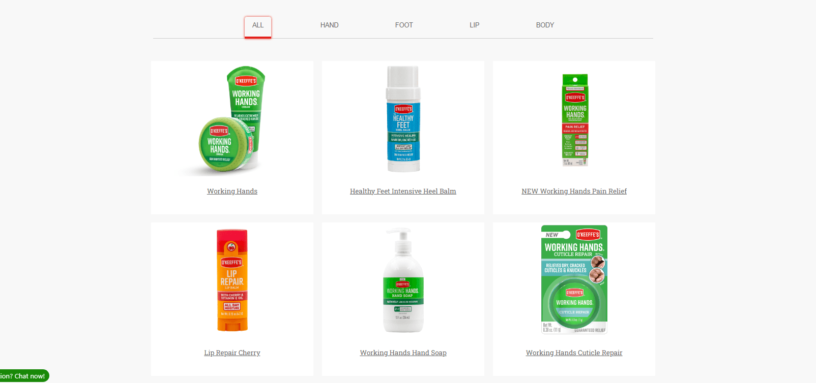
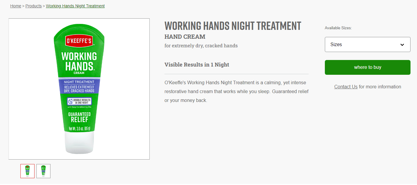
Wesbite has product listings with no E-commerce integration
Product availability displayed in nearest stores
Products for all types of usages
No “Add to cart” button instead shows ‘Where to buy”
This absence prevents customers from easily accessing O’Keeffe’s products or receiving personalized recommendations tailored to their specific skin conditions. Consequently, the shopping experience is suboptimal, leaving users without the guidance they need for effective skincare. Addressing these gaps presents a valuable opportunity to enhance customer engagement and satisfaction.
Heuristic Evaluation
Leveraging Research : Baymard Analysis
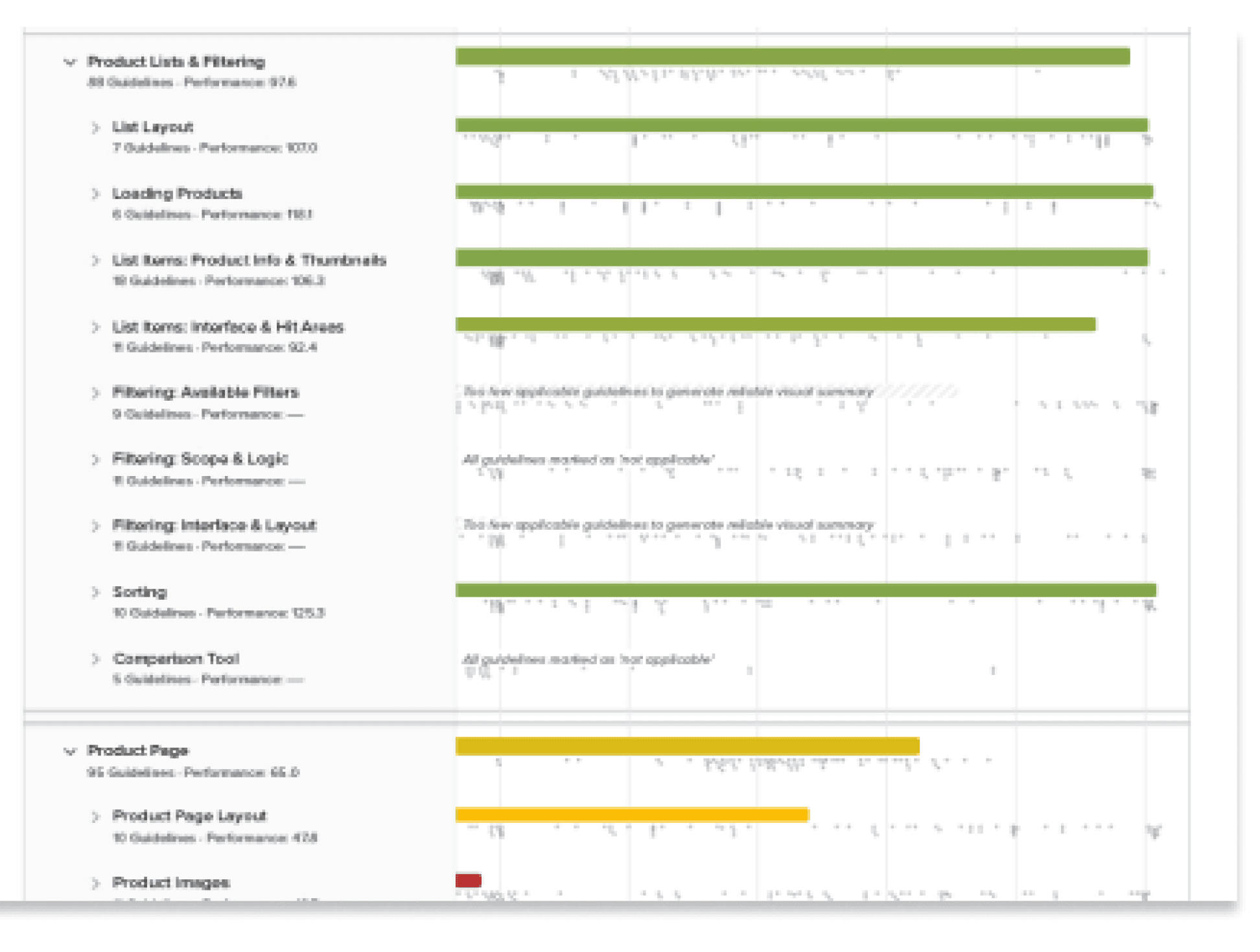
To ensure the app met high standards of usability, I conducted a heuristic evaluation of O'Keeffe’s existing website. Guided by Baymard Institute's renowned research on e-commerce usability, I identified several areas for improvement, particularly in navigation, clarity of product information, and overall user flow.
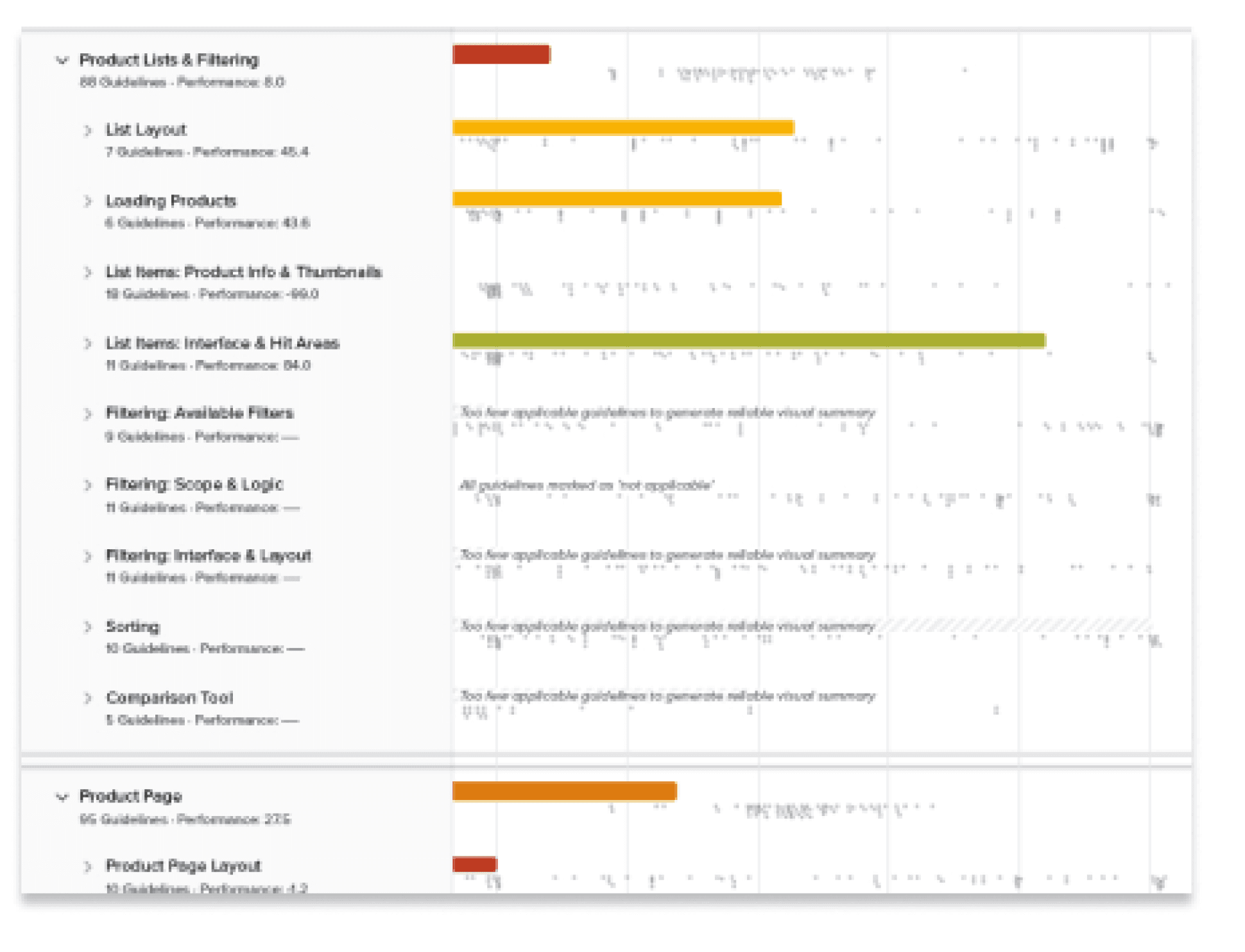
Before Score = 8
After Score = 97.6
Secondary Research
User Interviews: Hearing Directly from the Users
To deepen my understanding, I conducted semi-structured interviews with a diverse group of O'Keeffe’s users. These interviews provided me with valuable, qualitative data about the users' pain points, preferences, and desires in a skincare product. I structured the interviews to allow open-ended discussions, ensuring that I captured as many insights as possible.
Key Insights from Users
From these interviews, users expressed a strong desire for personalized product recommendations. They often felt overwhelmed by the choices available and were unsure which products would work best for their skin issues. These insights became the foundation for my design ideation process, leading to key features like personalized recommendations and skin severity assessments.

Discovery
What’s Working, What’s Not: Defining the Core Issues
Users highlighted a lack of clear guidance in choosing the right products and understanding the correct dosage. The existing website’s user experience did little to help, leaving an opportunity to enhance the overall journey through a digital solution that simplifies these processes.
What's working
The current website displays products and basic information
Users can browse the catalog and check store availability
Product listings offer descriptions and usage guides
What's not
The site lacks personalization and tailored recommendations
Users navigate a wide array of products without guidance
No user profiles limit tracking of purchases and preferences
Challenges and Opportunities
Identifying Key Areas for Improvement
I identified critical challenges and by addressing these pain points presents an opportunity to elevate the brand's engagement and streamline the shopping journey for users.
Product selection
confusion
Lack of
personalization
Complex dosage
decisions
Uncertainty in
treatment plan
Irregular Usage
& Skin care
Personalized
recommendations
Personalized
treatment plans
Severity based
assessment
Duration-based
recommendations
Product usage
tracking
Design
Persona: Targeting the Right Audience
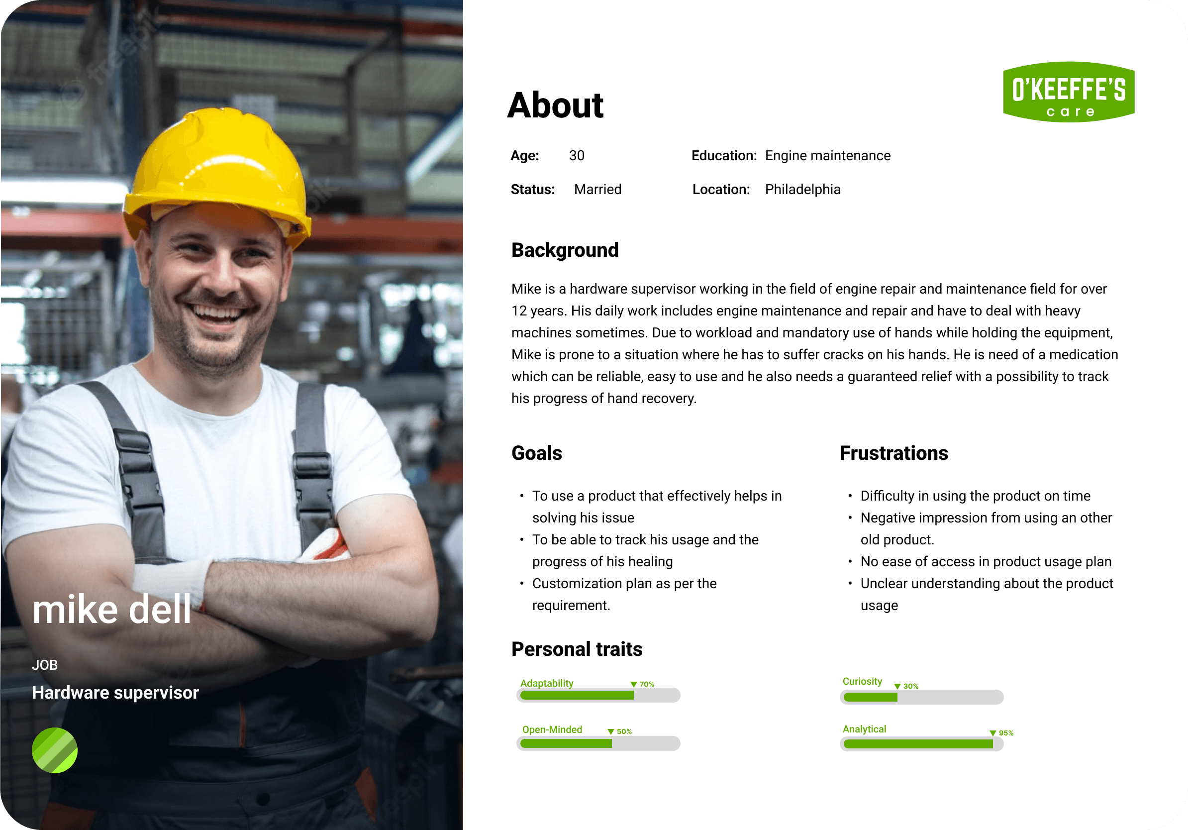
My primary persona for this project was individuals in labor-intensive jobs who suffer from skin conditions like cracks and bruises due to their work environment.
User Flow: Designing a Simplified Journey
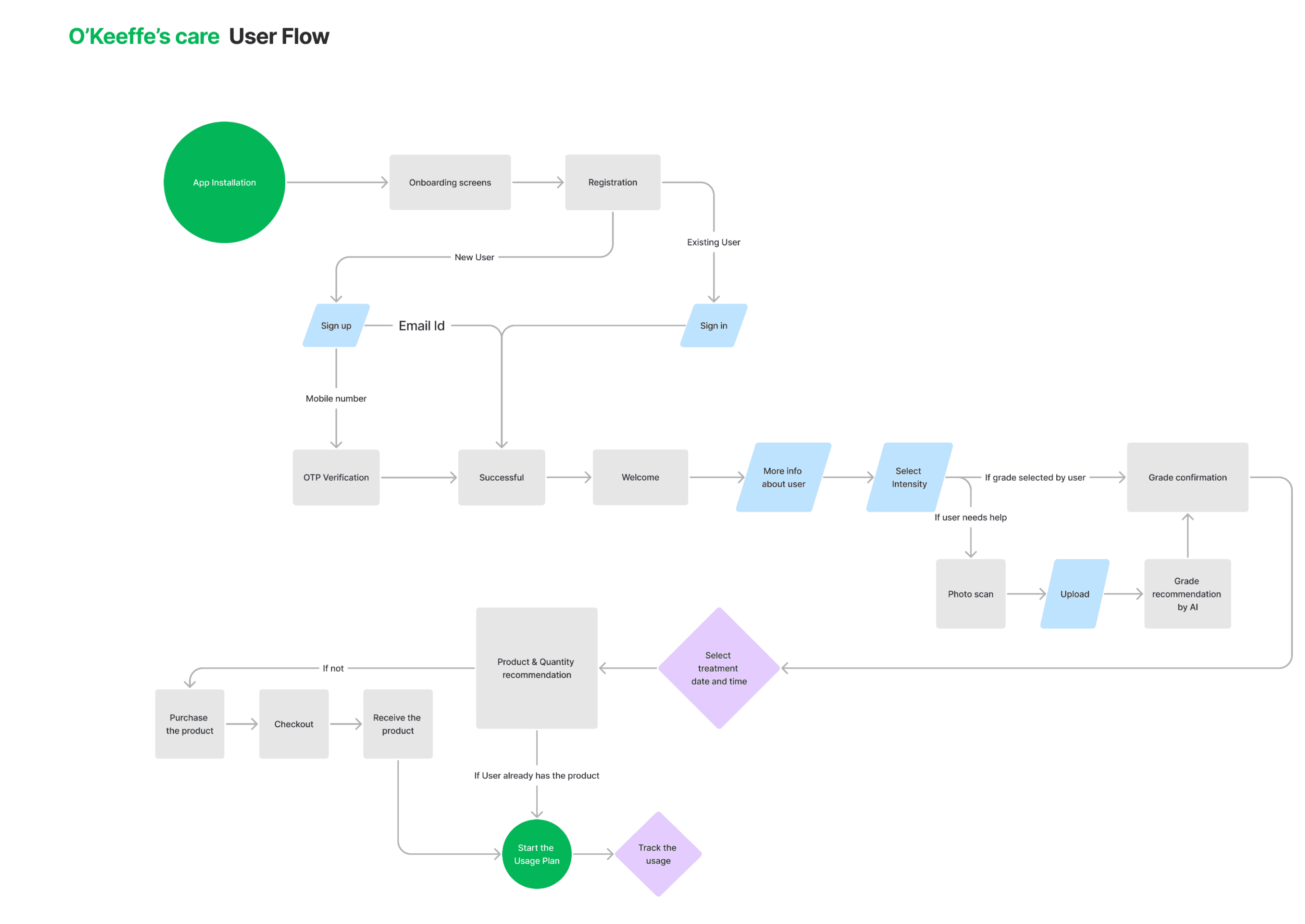
I designed a seamless user flow that guided users from assessing their skin conditions to receiving personalized product recommendations, and finally purchasing the products directly from the app.
Low Fi Wireframes: Sketching the Foundation
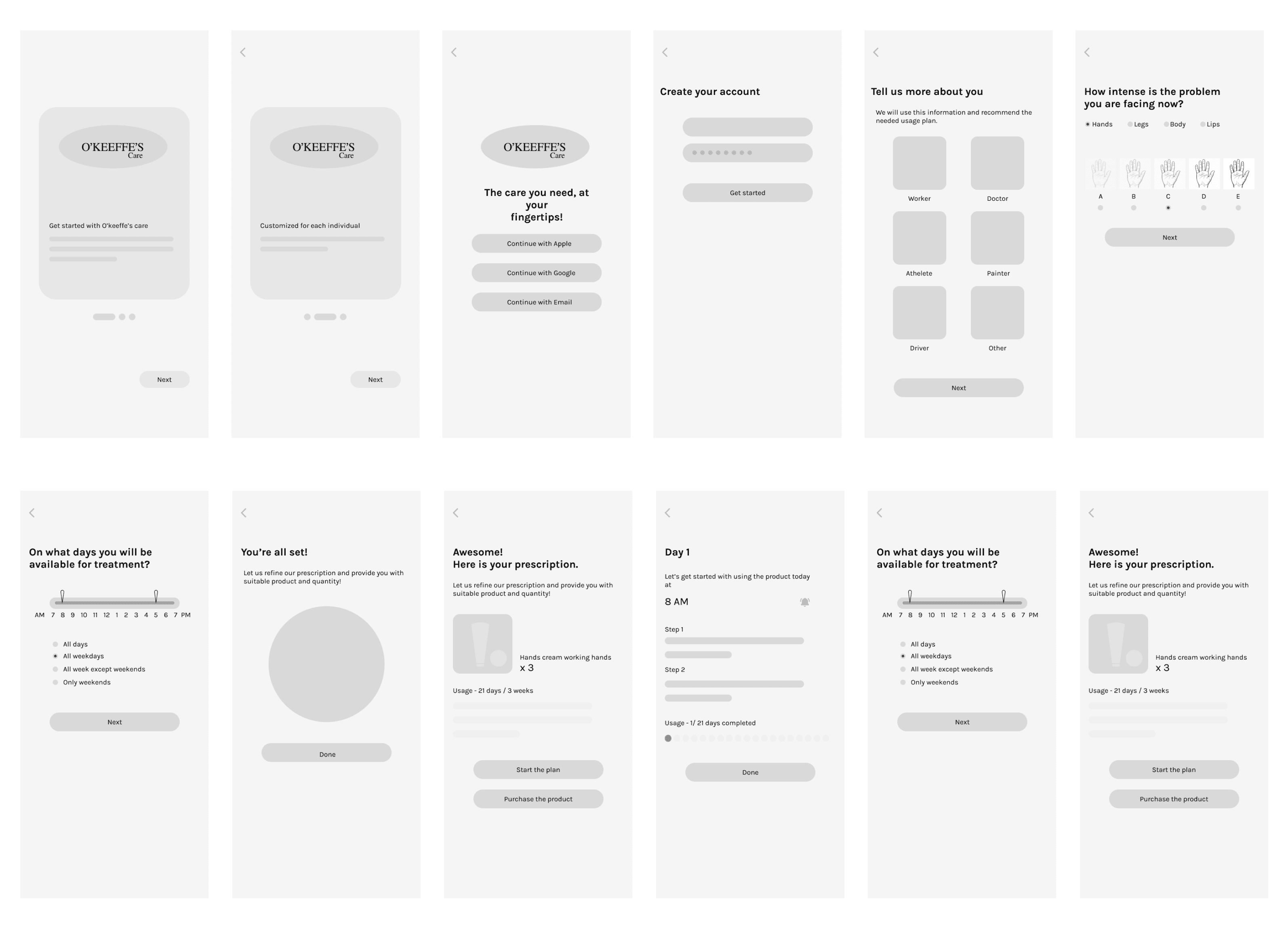
I began with low-fidelity wireframes to explore different layout options, focusing on the core functionalities like product selection, severity assessment, and purchase flows.
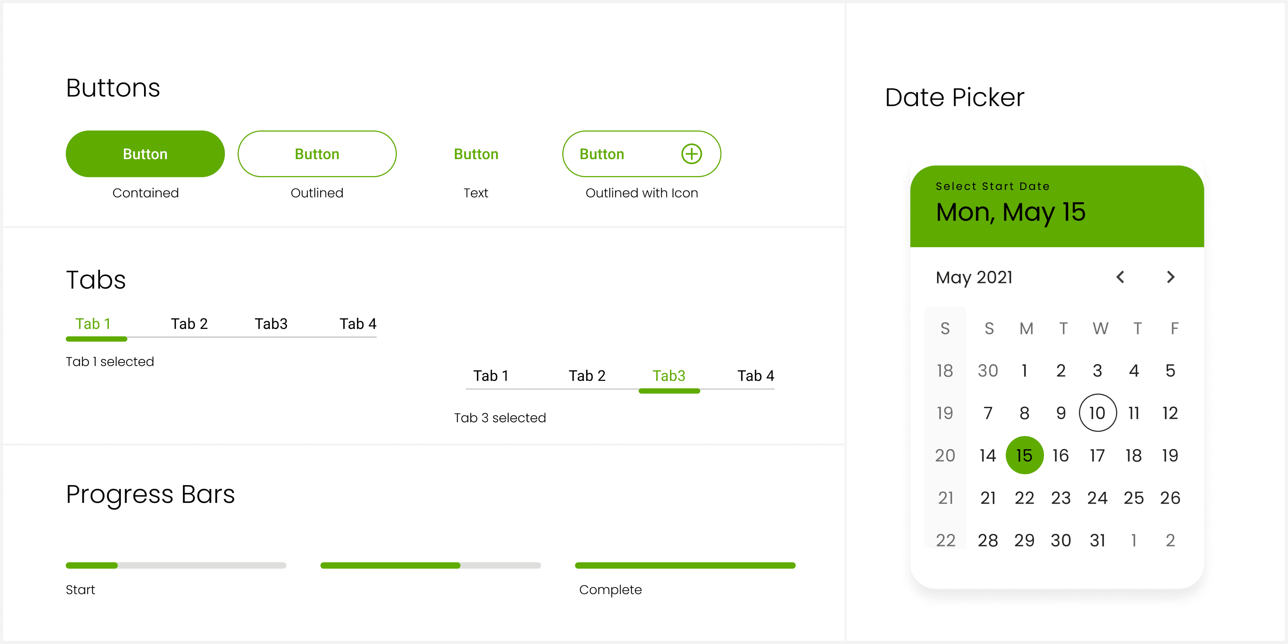
User Interface: Bringing the Design to Life
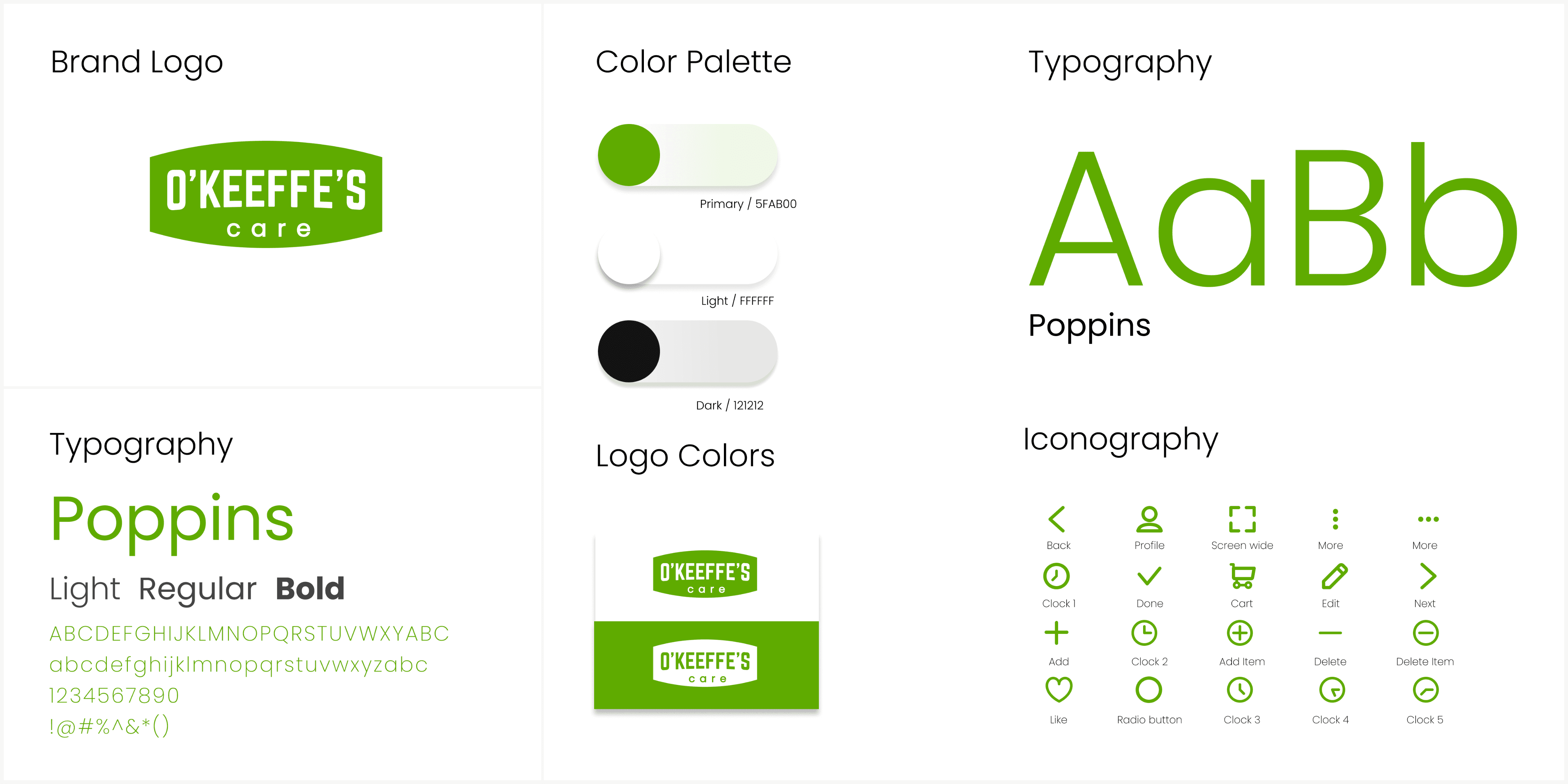
I began with low-fidelity wireframes to explore different layout options, focusing on the core functionalities like product selection, severity assessment, and purchase flows.
Solving Challenges
Challenge 1: Product Selection Confusion
Users often feel overwhelmed by the wide array of skincare products available without any tailored guidance.
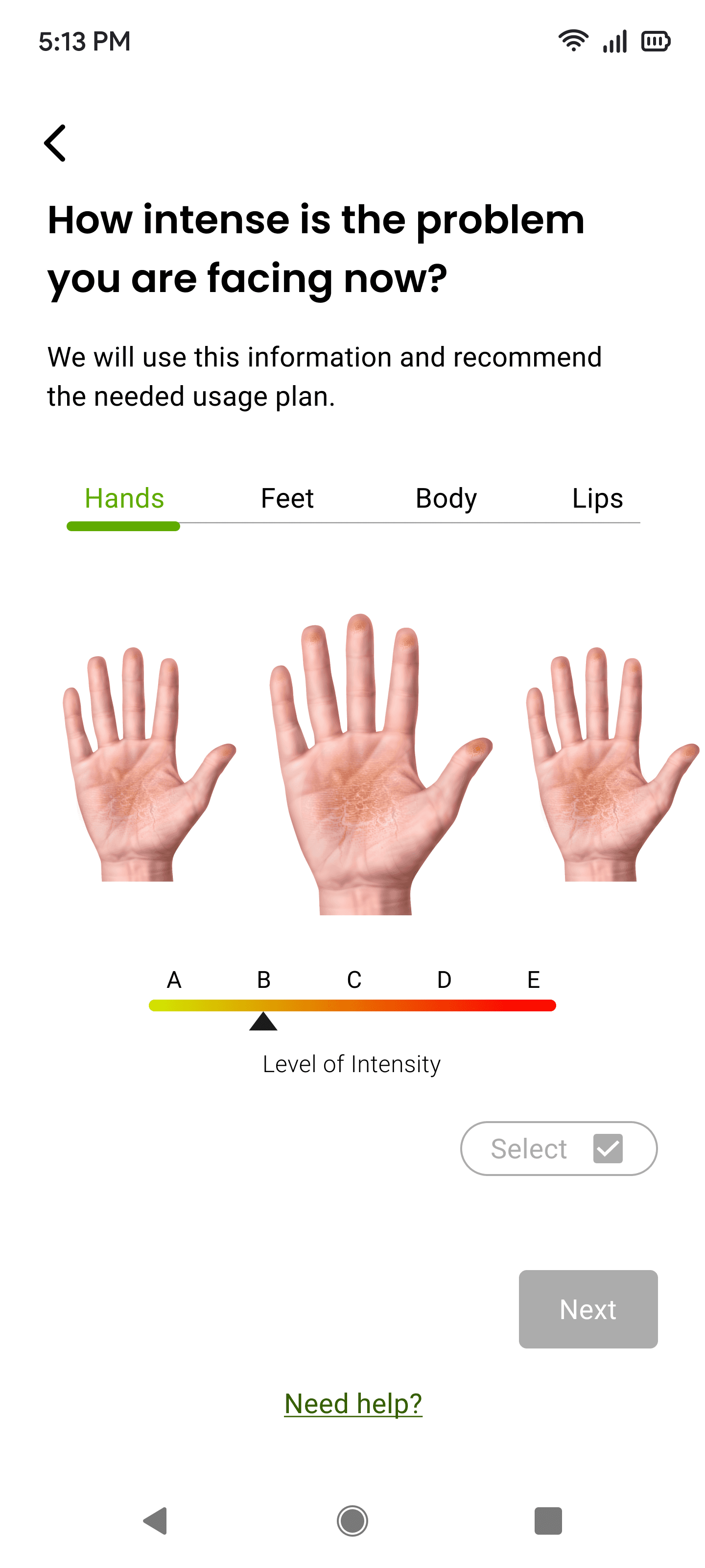
Opportunity: By creating a personalized recommendation engine, users can input their skin condition and receive curated product suggestions. I developed a flow where users could assess their condition visually via a severity selector for issues like bruises, eczema, and dry skin.
Solution: The app uses graphical representation and severity assessments to offer specific product recommendations.

1
Intensity selection for cracks
and bruises
A unique feature that allows users to assess the intensity of their skin conditions, specifically cracks and bruises. By providing detailed images of different severity levels, users can visually compare and select the image that best matches their condition.
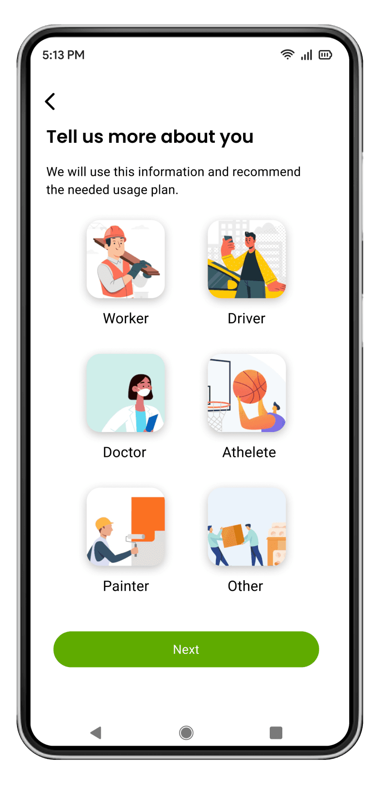
Selection based on user’s daily tasks
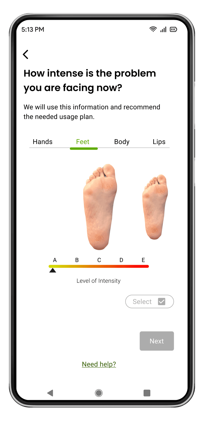
Intensity selection of bruises
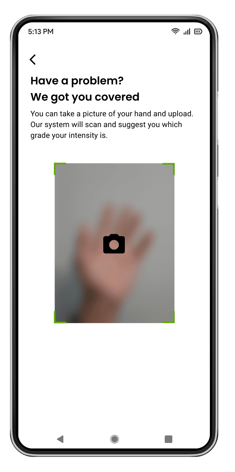
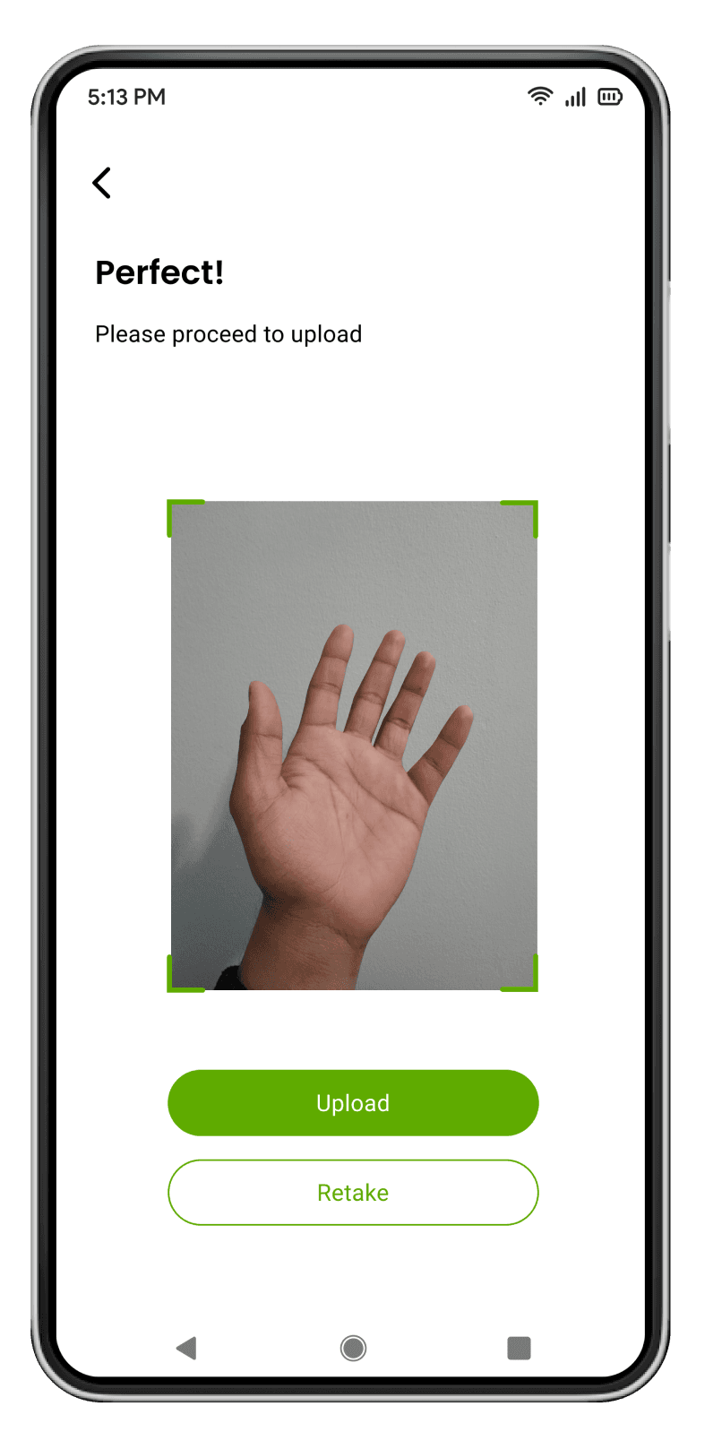
Image scan verifies the condition
Solving Challenges
Challenge 2: Complex Dosage Decisions
Users struggle to determine the correct amount of product to apply and how often to use it, leading to ineffective treatments.
Opportunity: Incorporating accurate dosage recommendations tailored to the user’s skin condition was key to improving treatment effectiveness.
Solution: The app provides detailed, step-by-step application guides based on the user’s input. Users are shown exactly how much product to use and how frequently to apply it. This feature includes:
Personalized dosage instructions based on condition severity.
Usage scheduling to remind users of their next application.
2
Accurate dosage recommendations
A feature that gives accurate dosage recommendations for skin care products. Offering tailored dosage instructions based on the user’s specific skin condition and its severity, helping prevent ineffective treatment or adverse effects.

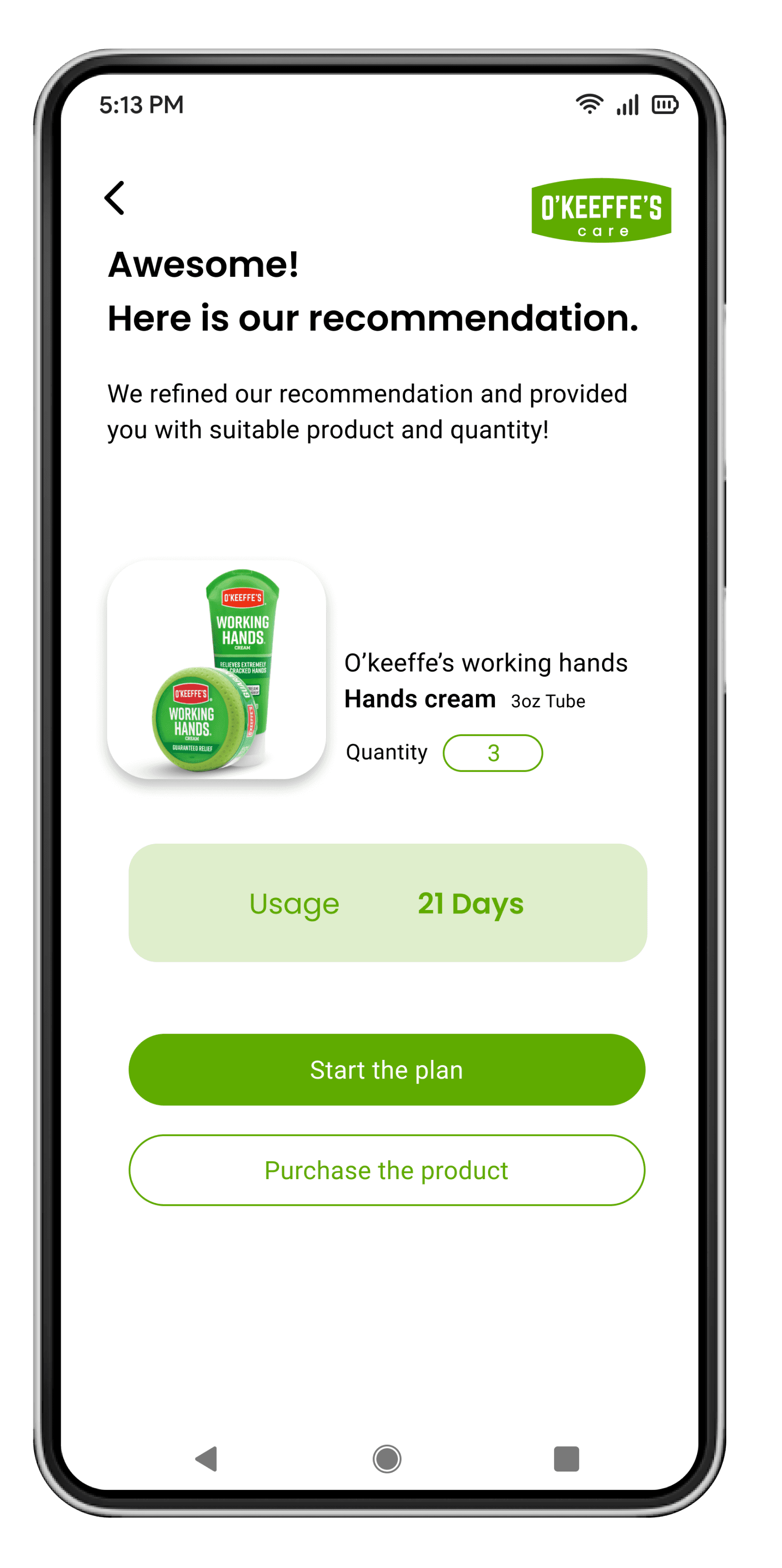
Accurate product recommendation
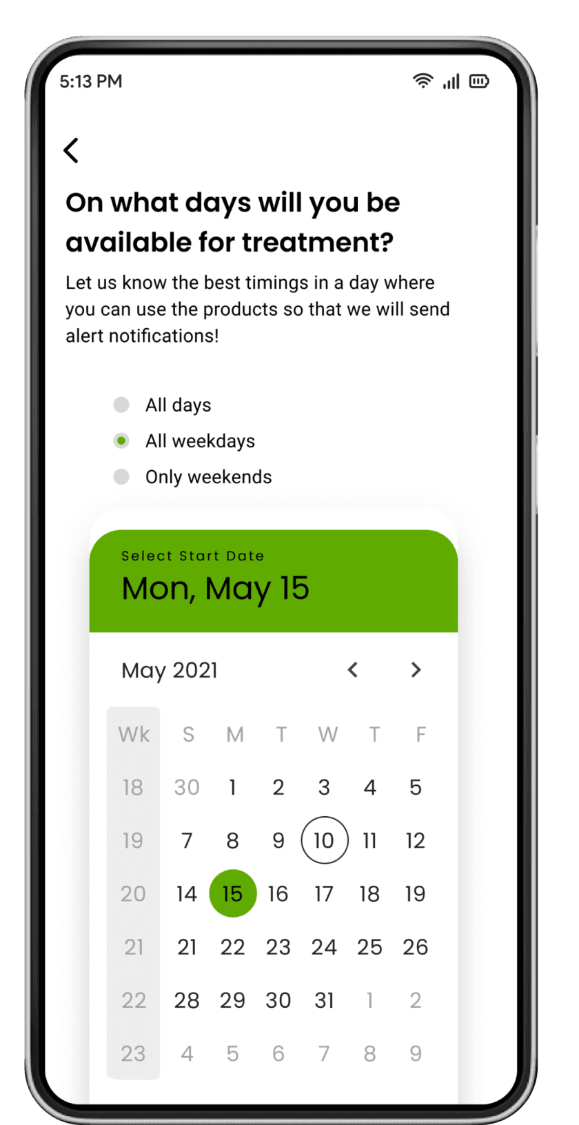
Product usage scheduling
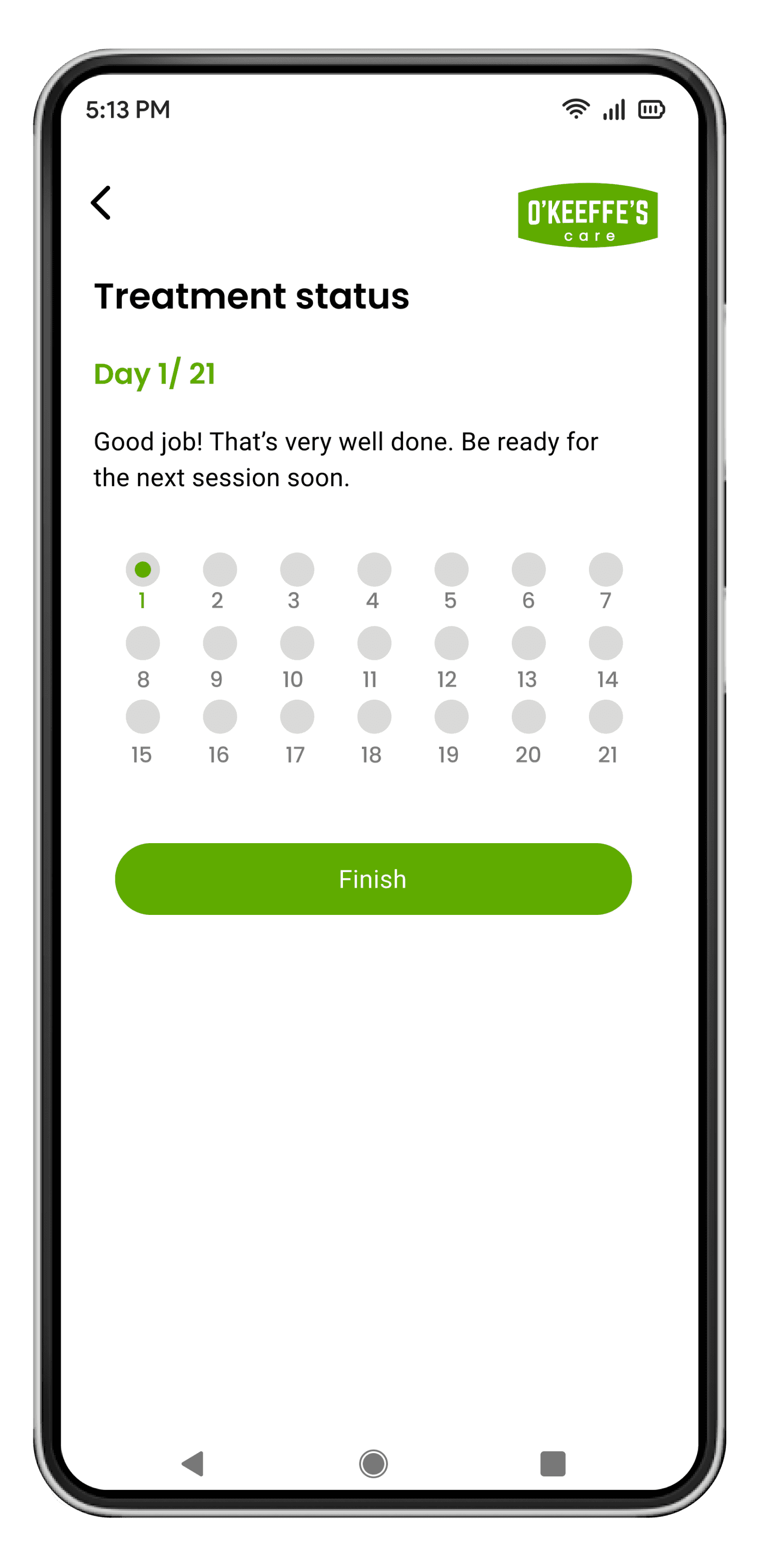
Daily treatment status
Solving Challenges
Challenge 3: Inability to Purchase Directly from the Website
Users have to visit third-party stores to purchase products, creating a disjointed experience.
Opportunity: A seamless in-app e-commerce platform allows users to purchase directly, reducing drop-offs and enhancing user satisfaction.
Solution: The e-commerce functionality lets users easily browse, add products to their cart, and complete the purchase without leaving the app. Mobile optimization and integration of payment methods like Apple Pay streamline the entire process.

3
Easy checkout and payment completion
A robust e-commerce functionality that allows users to add recommended products to their cart and complete purchases seamlessly. Users can easily proceed to checkout using various payment methods, including credit cards and Apple Pay.
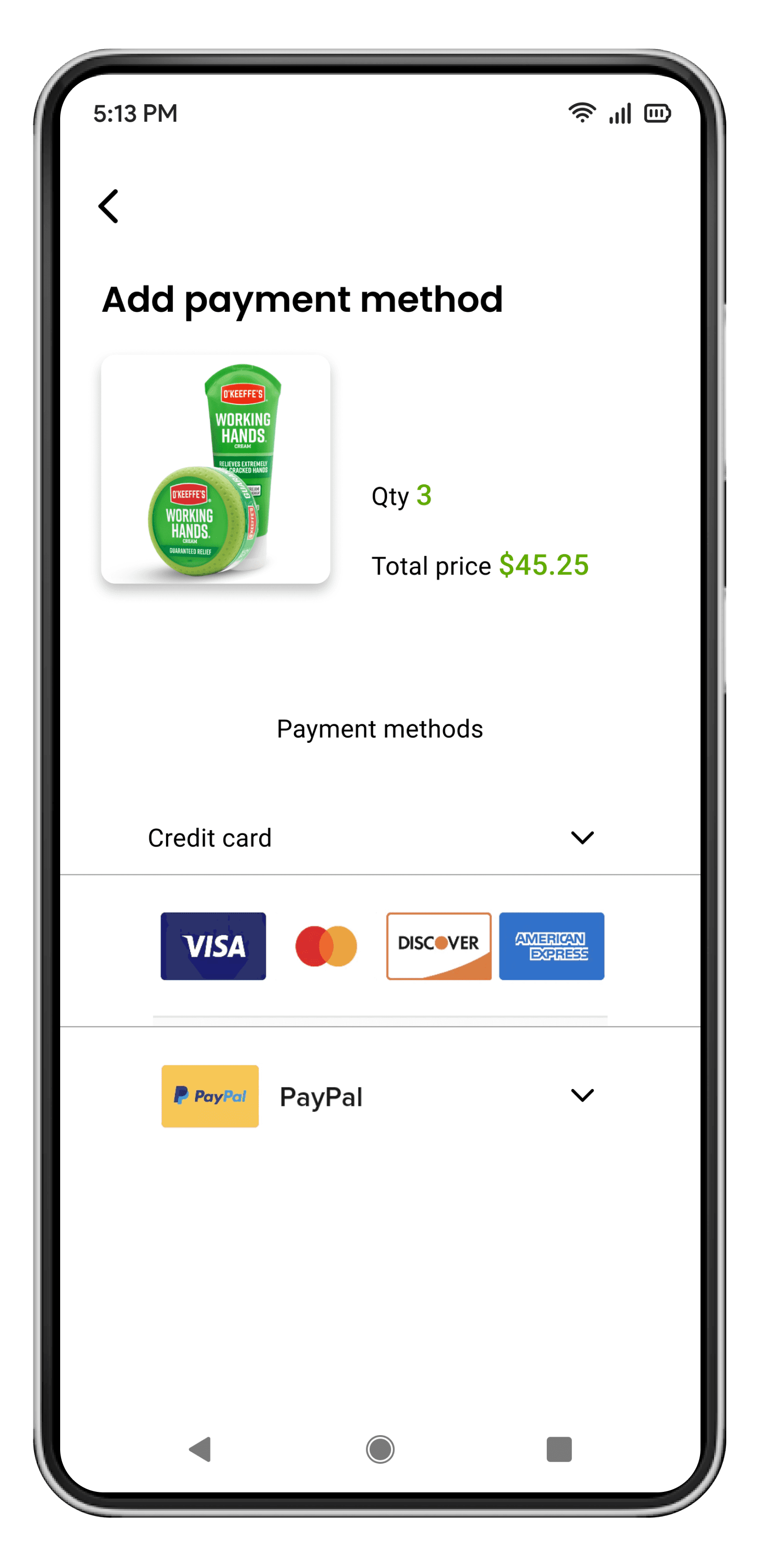
Convenient payment methods
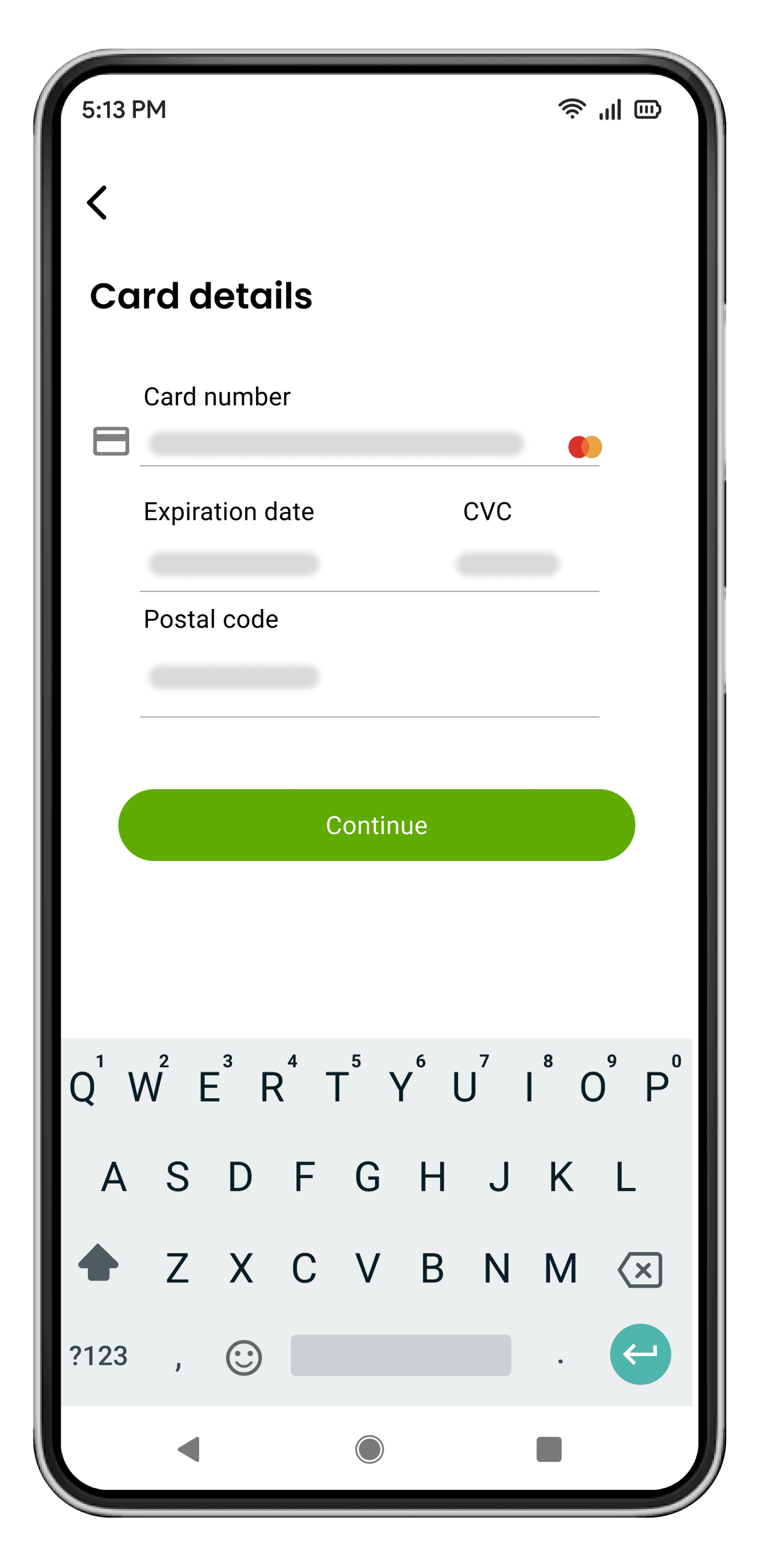
Easy to add payment details
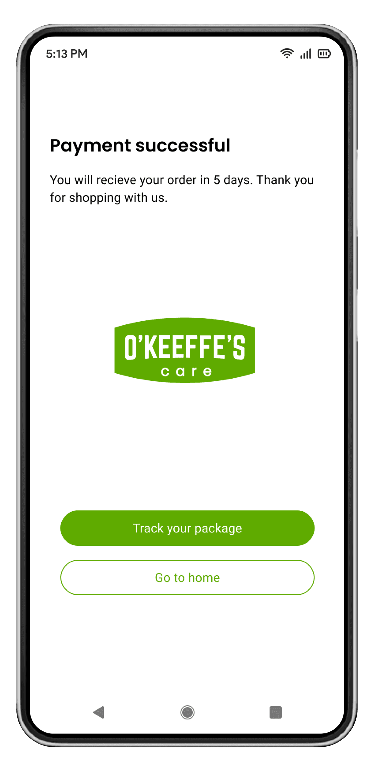
Track package after completion
Usability Testing
Satisfaction Survey: Users Rate Their Journey
User satisfaction
Overall satisfaction
4.7 /5
Ease of use
4.5 /5
Feature usefulness
4.8 /5
Task completion time
Intensity Selection
45 Secs
Dosage Recommendations
2 mins
Checkout Process
1 min
Key Takeaways & Learnings
O'Keffee's Taught Me
Comprehensive problem-solving
Recognized the need to address multiple aspects of skin care management through an integrated approach. This involved not only providing product recommendations but also ensuring users have the guidance they need to make informed decisions.
In-depth user understanding
Emphasized the importance of understanding user needs and preferences through extensive research. This user-centric approach ensured the app was designed to meet real user needs and provide a valuable experience.
Awareness of skin care challenges
Gained insights into the complexities of skin care management, emphasizing empathy for users in shaping product design. This understanding was crucial in creating a solution that truly addresses user pain points.
E-commerce
B2B
Gamification
Healthcare
Logistics
Fintech
Selected Projects
Coinquest
Designed a screen time solution with a 91% parent satisfaction rate, promoting responsible screen habits in children.
View Casestudy
